Hi everyone,
This week we are discussing How to measure Inequality and Why Measurement Matters. The two readings for the week are:
1) Ravallion, Martin. The Debate on Globalization, Poverty and Inequality – Why Measurement Matters
2) Milanovic, Branko. 2016. Global Inequality – A New Approach for the Age of Globalization. [Introduction and Chapter 1 – pp. 1 – 45]
Before starting the readings, I recommend you careful study my PowerPoint presentation with voiceover (to see the presentation properly – listen to my explanations and see the annotations – you have to go to Slide Show mode).
After you’ve seen my Presentation, watch the video below. They nicely describe the Pen Parade using Total Household Income data from the 2012 Current Population Survey (CPS).
In the PowerPoint presentation I introduced you to the concept of Purchasing Power Parity (PPP). Unlike simply considering the exchange rate for different currencies, PPP allows us to compare countries with very different income levels, taking into account the fact that with same dollar amount you can by more of certain goods in one country than the other. The Big Mac Index is a very simplified version of what the PPP does. Have a look at the video below. (On a side note, the Wikipedia Page (Wikipedia: Unusual Articles) they mention in the video is really pretty cool – the day I discovered this I spent weeks reading various random articles from there)
In our second reading for this week by Branko Milanovic, you are finally being introduced to the famous “Elephant Curve”. Be sure to watch the video carefully, it quickly and very nicely summarizes the main takeaways from this Graph.
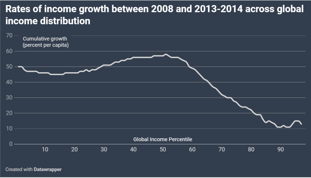
Below we have a new analysis of the “Elephant Curve” Comparing Income Growth in 2008 to that between 2013 – 2014. Read Milanovic’s explanation in this brief magazine article that just came out:
This week there are various learning outcomes for you to check. Be sure you understood what is:
- Purchasing Power Parity (PPP)
- The difference between absolute and relative poverty measures
- The difference between absolute and relative inequality measures
- Pen Parade
- Quantile Curve
- Lorenz Curve
- Gini Coefficient
Lecture Posts Questions:
On the comments section below, address the following questions (answers should be at least 100 words in length and posted by Sunday – This is how participation points are assessed. Please save your comments in a safe document before attempting to post it.
- From my PowerPoint presentation, what isn’t clear?
- Given the Information in the first video, what are the main aspects of the US Pen Parade in 2012?
- After Watching the video on the elephant Curve and reading Milanovic’s Magazine article published this week, answer what are the largest changes in World Income growth given the new elephant curve?

This entry is licensed under a Creative Commons Attribution-NonCommercial-ShareAlike 4.0 International license.
Question #1:
From my PowerPoint presentation, what isn’t clear?
The PowerPoint presentation was well organized with graphs and charts that I was able to understand via the drawings and explanations. At first glance, I was a bit confused on how to construct a Quantile/Lorenz Curve, but after reviewing the slideshow and understanding the differences between Absolute and Relative Measures, I became comfortable & better experienced with this idea. The exercise at the end to construct a Quantile & Lorenz Curve based on the given data was a helpful exercise which strengthened my practice, and improved my knowledge on this topic. Overall, I didn’t find anything particularly unclear as all the visuals and voice recordings tremendously supported my comprehension of the subject.
Question #2:
Given the Information in the first video, what are the main aspects of the US Pen Parade in 2012?
Using both the video and Powerpoint, the main aspects of the Pen Parade were individuals’ height corresponding to their income based on which class they fall into. For instance, I learned that the income of those in extreme poverty for a household of four members, is $2900 where this took a minute and 30 seconds worth of the Parade to illustrate this value. Deep Poverty for an annual income of $11,700 took about five minutes and 30 seconds. Next, what took up a chunk of the Parade’s time came from those in Poverty with an income of $23,500 followed by the Middle Class and the Rich. The last very few minutes of the Pen Parade finally outlined those very tall in height as they make up the top 1%, which was not at all shocking considering the US has 12% of Americans who make up that fraction of the World’s Richest. All in all, the video was indeed an insightful way to grasp this concept of our economy in 2012.
Question #3:
After Watching the video on the elephant Curve and reading Milanovic’s Magazine article published this week, answer what are the largest changes in World Income growth given the new elephant curve?
Given the recent elephant curve, the greatest developments in World Income growth is the surge of the poor and middle class incomes, as Inequality reduces, with the decrease of incomes shown by the rich (top 1%). From the 40th to the 60th percentile do we see strong advancements in the middle class as China became more wealthier, so much so that China’s prosperity has led to the redistribution of affluence all around the world in the displayed curve. Hence, taking upon a substantial role of lowering Global Inequality. India too, which shares an extensive population much like China, has been another guide to lessening global inequality rates. I’ve been truly pleased in seeing the new outcomes as it passably produces a fairness in income distribution.
1. In the PowerPoint, you mentioned the two different types of definitions for poverty. Which definition is considered the absolute poverty definition, and which one is the relative poverty definition? When measuring poverty in places like Malawi would that be considered an absolute measure or relative? Also, what is the reason for rich countries to use a relative poverty measure/line? Does a relative poverty measure in a rich country further show the great levels of inequality in that particular country?
I have a question about the PPP, it basically calculates the difference in costs between goods in two different countries, in addition to converting currencies? This PowerPoint presentation was definitely lengthy and covered a lot of information. I found myself stopping and replaying certain parts, but I still feel like it would be helpful to watch the PowerPoint again, because I really want to fully understand the material
2. The US Pen Parade serves as a visual representation of the unequal income distribution in the country. It shows how long the march would be for those in poverty compared to the rich, which gives us an idea of how much poverty there is in the US. Being that the height of the people increases as household income increases, it is very easy to see that there is extreme poverty in the US. Even though there were so many people marching within the poverty markers (which lasted several mins), it is sad to see that that the top 0.01% with household incomes of $10 million+ is the section that truly dominates most of the income in the country, considering that group only marched for 30 seconds.
3. The new elephant curve suggests that globalization has had a very positive impact on income growth for the middle class in non-Western countries like China, Vietnam, Thailand and India. One of the other major changes is that income rates of the rich in Western countries did not increase, and as Milanovic stated, some even experienced a decrease in income. Milanovic also mentions that this new elephant curve shows a decrease in the Gini coefficient, from 0.70 in 1988 to 0.62 in 2013. The article also discusses a pattern of globalization and inequality: once a growing country like China has become “sufficiently wealthy,” it has less of an impact on lowering global inequality levels. Instead, the country’s continued growth is no longer bringing balance to inequality but could result in an increase of global inequality. And so, it’s like a pattern, the role to equalize global inequality is handed off to the next poor country, which Milanovic says is India. In regard to China’s economy with the current COVID-19 pandemic, Chinese economic growth is still higher than the Western countries. He further explains that this will decrease the income gap between Asia and the West, and if China continues to grow at a rate of two to three percent every year, the Chinese middle-class will become wealthier than the Western middle-class. In addition, the Western middle-class will no longer be considered part of the global top 20% richest.
1. From my PowerPoint presentation, what isn’t clear?
The PowerPoint presentation had lots of diagrams that made me understand concepts like Gini coefficient and the Lorenz curve better. During the section about the Lorenz curve because I did not understand how to find the Gini coefficient from the graph but then I stopped to go over the audio and the annotations a few times and got it. I am now only confused with understanding the advantage of the Gini coefficient in terms of the anonymity principle and how they relate to each other. I was also confused about the connection between the Gini coefficient and scale variance but I understand the concept of scale variance.
2. Given the Information in the first video, what are the main aspects of the US Pen Parade in 2012?
The US Pen Parade in 2012 highlighted the difference between the rich and poor in the form of heights where the poor are shortest and the rich are the tallest. The time it took for the entire population to walk in order of income heights showed how severe the income gaps were when it took a while for the shortest group to walk by as opposed to the tallest that was a fraction of the time. The only issue with this diagram is that its hard to add every single person onto that parade so it is better to group these income levels. Th US Pen Parade in 2012 did help a person visualize the difference in income levels because it can be difficult to imagine how much the richest people in the US have compared to the ones below the poverty line.
3. After Watching the video on the elephant Curve and reading Milanovic’s Magazine article published this week, answer what are the largest changes in World Income growth given the new elephant curve?
After watching the video I saw that there was an increase in the income of the middle class in developing countries such as China and India that was greater than that of the lower middle class in USA. Based on the article by Milanovic the income gap between China and the US started to decrease after Covid-19 because they proceeded in income growth while the US was slowing down. The New elephant curve will show the middle class of developed countries being even lower than before compared to the income growth of the middle class in developing countries. This drastic income growth from China overtime helps with lowering the income inequality gap around the world but if they grow too much then they will be considered as one of the factors increasing global income inequality.
1. From the presentation, I feel like it was a lot of information one time and I did have to rewind to get a better understanding as well as take notes to help take it all in. On a side note, the graph showing the global income distribution in 2003 and 2013 was slightly confusing at first in the way it was broken down to explain the certain percentages of the population to describe income status (poor or rich), so I needed to watch that part a few more times for it to become a little more clear. Also, when it comes to measuring poverty and inequality in a specific place, how would one know which method is best for measuring it?
2. The main aspects of the US Pen Parade in 2012 was to show the uneven income distribution in the US. Income distribution was accounted for using height and how long of a time it took to meet the different markers that indicated the levels of annual household income and its association with poverty. The parade was set to show that as annual household income increased, the height of the people in the parade grew taller. When the parade was shown at the end, it is clear that income is uneven and there are more people living within poverty levels meaning more people with less in annual household income than in the top 0.01% with less people and more annual household income.
3. As shown by the new elephant curve, the largest changes in World Income growth has been an increase of income in countries that were once looked at as less developed. The new elephant curve also shows economic growth for the working class in developing countries in the world and shows the change in comparison the working class in counties that are considered more developed. It also explained that it does not show income per country but the economic distribution of the world. Countries that were once considered poor became in a sense wealthy because of introduction to new opportunities and resources.
1.
The lecture was very thorough and informative, but I do have lingering questions. In the graph that depicts “The global income distribution in 2003 and 2013”, it is stated that the gains were not equally distributed. If that is the case, then why do the curves look so similar? Shouldn’t the slope be slightly different between the two lines if the increased wealth is not distributed equally? Additionally, is there a reason why the United States has decided to measure its poverty in absolute terms as opposed to the typical practice of other high-income countries (using relative poverty measures)?
2.
The main aspects of the US Pen Parade are to demonstrate the profound inequality that exists in the United States, to do so in an understandable way, and to represent the scale of income inequality by using time as a representation of proportion. The US Pen Parade demonstrated how many Americans are “under four feet tall”, which represents the number of Americans living under the extreme poverty marker, or who make less than two dollars a day. It also shows that these Americans needed an entire minute and thirty seconds of the parade to be fully represented. The next group, those living under the Deep Poverty Marker brought the elapsed time to five minutes and twenty seconds. Another important aspect demonstrated is the fact that at the Halfway Point, the people in the symbolic parade are still under four feet, which is still far below average. This is explained as representing the fact that income is right-skewed, meaning that the few who are rich comprise more than half of the income in the United States. It is only until the last six minutes of the hour-long parade do the heights of the parade participants begin to increase very quickly. The tallest parade marcher was over 800 feet tall, sustainably dwarfing the smallest participants who stood at less than four feet tall, thus demonstrating the egregious gap between the richest and poorest people in the United States.
3.
The largest changes in world income growth include the fact that “hundreds of millions” of people are no longer living in poverty (Milanovic). Another change was the lack of growth experienced by working-class folks in countries that are classified as high income, such as the United States. It is interesting because the groups of people in low-middle income countries have benefitted greatly through globalization because they are no longer impoverished, have increased social mobility, better access to healthcare, and some countries have even become democracies; all within the last forty years (“Are There Winners and Losers of Globalization?”). However, other groups, like the working class of the United States have seen this growth manifested as lower wages and increased competition. It also demonstrates how those who have access to the global market are poised to see income increases rise exponentially, continuing to increase the gap between elites and working-class members.
1.From my PowerPoint presentation, what isn’t clear?
1. The power point lecture was truly clear. The charts were well organized and helped me with the readings. If it were not for the power point lecture, the readings would have been a bit more difficult. When it spoke about the Gini correlation and the PPP, I was able to understand it more because the power point lecture did a good job in guiding me. As I read the article, I used the quantile curve chart, and the Lorenz curve chart to understand absolute and relative measurements of poverty and inequality income. I took time to make my own chart at the end, I must admit that my last numbers were a bit off because I used the numbers I rounded. Overall, the charts and power point helped me.
2.Given the Information in the first video, what are the main aspects of the US Pen Parade in 2012?
2. The main aspects of the 2012 pen parade video are to show the inequality of income in the united states. Also, to expose that there is extreme poverty in the united states. The individual household and their height corresponded with their income in the pen parade. The smaller you are the less income you have, and the bigger you are in the scale, the more income. The pen parade scale portrays the levels of poverty and the inequality of income in the US. The pen parade video also explained how it is sometimes hard to see the issue of poverty and inequality because it is concealed, due to how everyone is segregated. The poor live with the poor, the middle class live with the middle class, and the rich live with the rich. The simulated parade exposes how the rich control half of the country’s income, and it is only the top ten percent, exposing the inequality of income in the united states. The last few seconds of the simulated parade were informative because when compared to the individuals in the beginning of the parade, we can see that there is poverty and we can see the true inequality of income.
3.After Watching the video on the elephant Curve and reading Milanovic’s Magazine article published this week, answer what are the largest changes in World Income growth given the new elephant curve?
3. According to the video many changes have occurred around the world. The wealthy and very wealthy have gained more than others. Countries that were considered third world countries have made a dramatic change according to the elephant curve. India, china, Mexico, brazil have increased income up to 50%,60%, and even 70%. Living standards have grown for these regions in the past twenty years. They are considered the back and the head of the elephant. The change is astonishing and inspiring to those who study the economy of the world. Another change is the rise out of extreme poverty, and 1.1 billion people have managed to rise out of extreme poverty. The working and middle class in rich countries did not change and did not see any growth and according to the video it was not expected for this to happen. Due to elements like companies and job placements abroad, the working and middle class are struggling to see growth. It has become a major issue when the top rich 1% claims that globalization is a good thing. It has caused many debates among those who are dealing with the consequences of globalization. Occupy wall street was a protest movement against economic inequality that occurred in New York City. It is an example of the working and middle class feeling that globalization is just benefiting the rich and the wealthy.
Franchely Abreu
Week 2- How to measure inequality
Professor Juliana De Castro Galvao
September 4th
Question #1
Everything was clear for me. It was thoroughly explained, with the graphs step by step. At one point I did get a bit confused with the graph of the absolute poverty measures. I just ended up listening to the voice over of that slide once again and then I understood it. The same thing happened with the Quantile Curve. The Gini coefficient was very confusing to me in last week’s work. Now I have a pretty good understanding of it. It’s the line between the perfect equality and the Lorenz curve. The “green area” as shown in the graph.
Question #2
The main aspect of the US Pen Parade in 2012 was to show how we tend to live in a ‘bubble’ and sometimes we aren’t aware of the amount of inequality our country is going through. The ‘shortest’ of the parade was only making two dollars per person per day, $2900 annual income for 4 people, this is something very shocking and I didn’t think that was possible in the US. The halfway point of the parade didn’t have any significant height increase since the income distribution is mostly for the rich. The rich get richer, the poor get poorer. The last 10 percent accelerated quickly in height this is because the rich have extreme wealth. This is like an outlier in a graph that is why the average of the country’s wealth is not accurate, and it doesn’t accurately represent the poverty rates in the United States. The 90th percentile making $114,000 annual income which is taking half the country’s economy.
Question #3
After watching the video on the elephant curve and reading Milanovic’s Magazine article published, the largest changes in World Income growth given the new elephant curve was a dramatic growth of 50, 60, and even 70 percent. These nations were India, China, Mexico, and Brazil. Unlike the working class that didn’t have any growth or like Milanovic mentioned it decreased. This is due to the fact that manufacturers that are included in the working class and this job is getting replaced by robots. For example, Apple products where previously made in the US now it’s made in China by robots.
1. From my PowerPoint presentation, what isn’t clear?
I understood everything in the power point it was well written but the only thing I found unclear were the graphs.
2. Given the Information in the first video, what are the main aspects of the US Pen Parade in 2012?
The use Pen Parade showcases how income was distributed unevenly between the poor, middle class and rich. In the video they used the height of individuals to demonstrate that there is a high rate of poverty within the economy. What I also found intriguing is that at the end of the Pen Parade is showed that there were only 1 percent of wealthy people with high income, while the working middle class were the ones that struggled.
3. After Watching the video on the elephant Curve and reading Milanovic’s Magazine article published this week, answer what are the largest changes in World Income growth given the new elephant curve?
After watching the video and reading the article some of the largest changes in the world is that places like china, India and Mexico, these countries people use to consider third world, has risen and been placed in the global supply chain. The Elephant curve also shows the struggles that the working and middle class face in countries that are developed like, Canada and the US, these people are still stagnant and have not seen any improvement due to competition with cheaper labor abroad but also with automation.
1. From my PowerPoint presentation, what isn’t clear?
From the powerpoint presentation I didn’t clearly understand the graph that showed the global income distribution in 2003 and 2013. The way each part of the graph was labeled and broken into different sections (blue writing and red writing) did not add up to me when I tried putting all the information together. The second part that I had trouble understanding was how relative and absolute income are incorporated in the chart.
2. Given the Information in the first video, what are the main aspects of the US Pen Parade in 2012?
Given the information from the first video the main aspects of the US Pen Parade is firstly, that individuals’ heights are matched with their income. In the US Pen Parade for 2012 the diagram displays Total Household Income from 2012s population survey. Individuals who earn average income are average height and individuals who earn twice the average income are twice the height of an average person. Families of four living in extreme poverty had an income that averaged out to $2900; Families of four living in deep poverty earned an annual income of $11,700 and the threshold for a family of four is $23,500. By the middle mark of the parade all individuals accounted for have only reached 4 feet, which is below average height. As the US Pen Parade continues we see that the right side is skewed, as the upper middle class and the rich have more income than the rich. Because the rich hold more income there is less income for the poor individuals. The top .01% persons height averages out to 827 ft tall, representing a household income over $10 million. By understanding the Parade it helps us to better understand how annual family income is distributed throughout the country; Once we understand this we could better understand our country’s economy and be able to compare it to other countries.
After Watching the video on the elephant Curve and reading Milanovic’s Magazine article published this week, answer what are the largest changes in World Income growth given the new elephant curve?
3. The largest changes in World Income growth given the new elephant curve show that within the last 40 years countries that used to be classified as “third world” have had an income growth of 70%. An example of this is a village in Mexico; The village was severely poor but over the years they found ways to generate income by selling pottery and paintings abroad using Ebay and other outside services. Today, there is electricity in this village and the people aren’t dying yearly as before. The results of the elephant curve showed an important difference; The difference between the middle-class Asians and the middle-class Westerners. Middle-class Westerners see less income growth than the poorer Asians because many western companies are outsourcing in Asian countries. Although the middle class in Asia earns less than the middle class in the U.S. they have more job opportunities which allows their annual income to increase throughout the years. Whereas in the U.S. the middle class income does not increase gradually.
1.- Based on viewing the power point, I pretty much understood everything that was explained on it. Information ranging from the measuring and differences of poverty and inequality to the Lorenz curve and Gini coefficient slowly became understandable for me except for a few things. I personally think that the entire power point was actually beneficial to the learning of poverty and inequality. One thing I quite didn’t understand completely was the construction of a Lorenz curve and the Gini coefficient. On the other hand, I do understand the concept of the graphs and charts relating to what they represent.
2.- From watching the video, the main aspect of the pen parade is the representation of inequality in terms of the distribution of income ranging from those in deep poverty to the top 1%. It was very interesting the way the video explained household income by showing the height of people increasing as income arose. In addition I also found it very mind blowing, the insane gap between those in poverty and the middle class to those at a higher income level. The distribution of income truly has to be fixed in our country since by looking at the video, those in poverty would take up most of the parades time of marching for several minutes compared to the top percentage only marching for a couple seconds. Overall, these aspects of the pen parade was an interesting way of representing the economy back in 2012.
3.- As seen by analyzing the elephant curve in the video, there has been a drastic increase of income for the middle class in other countries except the U.S due to them being replaced. As an example, as I read Milanovic’s article, he explains how countries such as China, Indonesia, Vietnam and Thailand have all doubled in terms of middle-class income thus referring to that as “the emerging global middle class”. I believe that this poses a major change in the income growth of the world because even though it’s a positive that these people who were once in worse economic situations are now able to prosper, it is badly affecting those in that same class within our own country, ultimately leaving them with no job or room for improvement. Lastly, I believe that the only way for everyone to prosper is by the economy having a certain balance but if one group of people prospers too much such as those in the middle class in other countries, it will further push the world into a deeper form of inequality.
1.From my PowerPoint presentation, what isn’t clear?
For the most part, everything was clear, but I am still a bit confused on Absolute and Relative measures of poverty/inequality. I understand that the relative measure does not change when the proportion is the same and absolute measure does. What I don’t really understand is why these measurements are used and if there is a clearer definition to both because the numbers made it a little confusing.
2. Given the Information in the first video, what are the main aspects of the US Pen Parade in 2012?
The main aspects of the US Pen Parade in 2012 was to show the full income distribution among families in the United States. When we think about extreme poverty, we tend to think of poor countries like Africa and countries in Latin America, but what we fail to realize is that there is extreme poverty in the United States as well. The parade focused on the heights of the people based on their income, and this allowed us to see how income is distributed in the United States because the very short people were the most in poverty and as the height grew, the income for household did too. Although the incomes were increasing, by the time the parade got to the middle class individuals, they were still pretty short which allowed us to see how most of the income goes to the rich. In the United States, most communities contain people with similar household incomes and they explain that this is the reason why inequality is so hard to see, but the parade allows individuals to see the truth with the income distribution.
3. After Watching the video on the elephant Curve and reading Milanovic’s Magazine article published this week, answer what are the largest changes in World Income growth given the new elephant curve?
The largest changes in World income growth given the new elephant curve is globalization and the new technology that is presented as years go by. For example, in the video, they talk about robots and the way that they can work faster than humans and at no cost. These robots are changing the World Income because it is producing more income since labor does not have to be paid, but it is taking jobs away for those that need it. Also, the development of countries and their motivation to move away from poverty is causing the largest changes in World income growth because they are using different ways to obtain income and new opportunities. For example, in the video they explained how the village went from being extremely poor to more or less average. They went from starving and having nothing, to building a school, using email, federal express, electricity, etc. Globalization is also a large change for the World income because companies are taking their businesses and organizations abroad in order to obtain cheaper labor and more money.
#1 From my PowerPoint presentation, what isn’t clear?
The PowerPoint presentation was very clear and understanding. At first, the global income distribution in 2003 and 2013 was a bit confusing. But after reviewing the rest of the graphs I was able to understand the information. The graphs were helpful because it breaks down the information little by little especially the highlighted sections. I was happy to see that you placed a video in the PowerPoint because it gave me a more boarder perspective on the value of money in the different countries. The big Mac concept using the purchasing power parity was helpful. I was able to understand more in-dept the economic productivity and living standards of the comparison of each country.
1. Given the Information in the first video, what are the main aspects of the US Pen Parade in 2012?
The main aspect of the US Pen Parade is to show the income distribution by using the height parade method. The heights are proportional to each person’s income ranging from the lowest to highest. The heights of the people in the parade illustrate the distribution of income inequality which represents the whole population. People with average height represent people who earn an average income. This highlighted the poverty inequality in the United States by showing the growing increase of high-income inequality and the decline of social mobility. The U.S pen parade makes it easier for us to see the high increase of income inequality.
1. After watching the video on the elephant Curve and reading Milanovic’s Magazine article published this week, answer what are the largest changes in World Income growth given the new elephant curve?
The largest changes in the world income growth given the new elephant curve shows that people in the middle class of the global income distribution incomes grew more than doubling or triple in many cases who lives in Asia and China. Whereas, people who were richer than the Asians experienced much lower income growth rate mostly in cases of people who lived in more advanced economies such as Japan, the United States, and countries of Western Europe. Also, the richest 1% are mostly included citizens of industrialized countries who are the ones who benefits from high-income growth rates just like those in the middle of the global income distributions.
1) The PowerPoint was well thought out and pretty good with understanding it. It was just a lot for one seating. One thing I can say though is that I need to revisit relative vs absolute poverty and how they are measured. I found the videos from this lecture to be very interesting and I was able to understand.
2) The Parade strategy was used to show the income distribution within families of four. We usually don’t see the income distribution because like it was pointed out at the beginning of the video we mostly live around families that are just like us. Poor families live with other poor families and vise versa, in that way it is unlikely to notice the inequality around you. Now the way inequality was introduced in the Parade in order for us to see it was by height, the crowd of parade’s heights is proportional to what the household makes. People that make the average income would be of average height and so on. From lowest to highest, as soon as the parade started for a good while people’s height would stay the same even at the midpoint of the parade. In the last five minutes of the parade that was when we started to see a change in the heights which is where we were shown the 10% and 1% of people that made high incomes.
3) The elephant curve focuses on the growth of income due to globalization in the world. It is used to show rising inequality throughout the years. The largest changes in world income growth were the most surprising being that the income growth was shown more in underdeveloped countries due to new opportunities. While other countries were getting out of poverty, the U.s which is considered a well-developed country was showing no growth from the working class. But of course the wealthy just keep getting wealthy. For example like shown in the video a village in Mexico would worry that their corn would not last for them to survive, but they started painting pictures doing pottery to sell abrod which is where they gained most of their income to live a comfortable life. Whereas in the states for working-class individuals there was no growth because due to globalization people’s jobs were being taken from them like the Apple company example, Apple’s products use to be manufactured there would be manual labor but now they have robots machines that took their place. That alone caused their jobs and for the income to not change.
1.From my PowerPoint presentation, what isn’t clear?
There was a lot of interesting information given this week through the power point, the 3 videos and the readings. I think I was a little lost this week through the information that was given. I was a little confused when I was watching the videos. Through PowerPoint trying to understand the graphs between the different economic systems. Also through the slide understanding how to measure inequality. Another thing that was unclear was learning about Gini Coefficient.
2.Given the Information in the first video, what are the main aspects of the US Pen Parade in 2012?
The main aspects of the US Pen Parade in 2012 was to show the different incomes in the country. The income shown from the poorest income family to the riches income family. In the video they used a height system to show how the households in the United States are represented as a person. According to the video the heights of the parade were organized by the “household making an average income are average heights. The households making twice average income would be twice average height.” The height will continue as the income of a family gets larger.
3. After Watching the video on the elephant Curve and reading Milanovic’s Magazine article published this week, answer what are the largest changes in World Income growth given the new elephant curve?
After Watching the video on the elephant Curve and reading Milanovic’s Magazine article published this week, the largest changes in World Income growth that is given the new elephant curve is that countries have increased income growth. Countries such as China, India, Mexico and Brazil that increase 50%,60% and 70%. Most jobs that were provided in the United States to many individuals were taken away and given to people in different countries. The jobs were even given to different machines. As machines become more advanced there will be less jobs for individuals.
1) The powerpoint presentation was very clear, especially when explaining the quantile and Lorenz curve and how to construct them. Something I am a little confused on is PPPs. I understand that PPPs basically measures the difference of what amount of money can get you a service or a good in once country versus a similar service and good in another country. The powerpoint explained that this is useful in comparing countries because they eliminate price level differences across countries and equalize the purchasing power of countries. However, I was wondering if this calculation took income differences into account? For example, as per the example provided, it might be easier to earn $50 USD than 239 ZAR. Is income difference technically reflected in the differences in prices of goods and services between countries?
2) The main aspect of the US Pen Parade is to illustrate income inequality in the US. It does this by giving us an imaginary scenario in which in a parade the heights of people is proportional to their income. That is to say that the more you earn then the taller you are, so those earning an average income would have an average height. The less income you earn then the closes to the front of the parade you are, so the richest individuals are all the way in the back. The parade takes about an hour, and so it illustrates that we see people below average height, and therefore earning a below average income, marching for a long time when compared to the richest individuals who march for less than a minute but whose height is much much bigger. This serves to visualize income inequality by showing us how much more people live in poverty compared to how few individuals are incredibly rich.
3) The largest changes is that 1.1 billion people have rise out of extreme poverty. Globalization has resulted in less global inequality, with people in poorer country highly benefiting from this, while the middle class in the US and other rich countries have seen little to no income growth. The new elephant curve reflects the same result with global inequality reducing. One difference is that China was responsible for a lot of the income growth presented in the first graph due to its big population. However, China has become wealthy enough that it no longer plays an important role in lowering global inequality and may actually contribute to rising global inequality.
1. From my PowerPoint presentation, what isn’t clear?
The PowerPoint was clear to understand until the last couple of slides on constructing a Lorenz curve. The chart was hard to comprehend; precisely, converting each person’s income to a cumulative percentage of income. I had to look over the slides a few times to understand the charts’ calculations. After figuring out the example from the last income percentage and doing some examples, it was clearer. Another topic that was a bit confusing was learning how to read off the graph, the Gini coefficient in the triangle area. During the lecture slides, I looked up why the Gini coefficient is related to the Lorenz curve.
2. Given the Information in the first video, what are the main aspects of the US Pen Parade in 2012?
The US pen parade of 2012 points out the different aspects of inequality in the United States. Presenting households’ income in a parade to show the United States’ distribution of money is unequal. More families live below the poverty line than others in the parade. They talk about how people don’t see the inequality in this country because of how segregated we are according to the amount of money earned. Allowing people not to see the disparity in their everyday lives, not view the one percent take half of the country’s revenue. Education was another issue they addressed and asked if the opportunity to get an education is equal for every household.
3. After Watching the video on the elephant Curve and reading Milanovic’s Magazine article published this week, answer what are the largest changes in World Income growth given the new elephant curve?
After watching the video on the elephant curve, the world benefited from globalization differently based on where they live. In developing countries, there was a growth in the number of earings for each individual. While in rich countries, many of the workers were replaced by robots making their income rates stagnant. The growth only benefits the one percent and the poor developing countries using cheap labor. However, the article does state the growth in these developing countries; for example, India does not have poverty disappear out of their country e because more people have an opportunity for a job and an increasing income rate.
1. From my PowerPoint presentation, what isn’t clear?
Exactly how can we plot the different measure systems? And is it preferred we use the Gini Coefficient? Also, I was discussing with a close friend of mind is it safe to stay instead rich vs. Poor it is Poor Vs. Robots.
2. Given the Information in the first video, what are the main aspects of the US Pen Parade in 2012?
The main aspects of the US Pen Parade are the fact that in the United States a rich country, many of the people that are living are living in extreme poverty. When we reach the halfway point in this parade, we are still seeing various types of poverty. We see families sustain themselves on 2 dollars per member, or adults who work very hard, working multiple minimum wage jobs just keep their selves afloat. What has been pointed out by the video hosts is that we never seem to notice how big the difference between the timing is because we are only around people in our “class”. The rich live with the rich, the middle class with the middle class, and the poor with the poor. It makes it hard to fully understand the differences.
2. Watching the video on the elephant Curve and reading Milanovic’s Magazine article published this week, answer what are the largest changes in World Income growth given the new elephant curve?
The largest change in World Income growth given the new elephant curve is the reduction of global inequality. As a result of globalization 2.0, we have expanded our technological prowess, allowing us to be connected in ways we never thought before, giving many people in poverty new sources of income. With examples like China and India, we can see the positive effects, where their middle class is growing. One thing about the new elephant curve is the losing middle class. They are not as poor as the rest of the world, but they are missing out. Being overlooked in our growing world. Where the middle class are losing their jobs and are seeing fewer opportunities to elevate their selves.